Thursday, October 6, 2011

N—N.C. Wyeth

Ok, I haven’t written anything for this blog in a while and I know that there are other “n” topics out there. But I was having a conversation about illustrators vs. fine artists today and NC Wyeth came to mind—the penultimate illustrator who’s work hangs as example of classic American art. “[NC Wyeth]: one of America's foremost illustrators and painters.” (http://www.ncwyeth.org/)


Newell Convers Wyeth was born on October 22, 1882, in Needham, Massachusetts. Growing up on a farm, he developed a deep love of nature. His mother, the daughter of Swiss immigrants, encouraged his early artistic inclinations in the face of opposition from his father, a descendant of the first Wyeth to arrive in the New World in the mid-17th century. His father encouraged a more practical use of his talents, and young Convers attended Mechanic Arts High School in Boston through May 1899, concentrating on drafting. With his mother's support he transferred to Massachusetts Normal Art School and there instructor Richard Andrew urged him toward illustration.(www.ncwyeth.0rg)


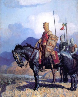
In 1902, NC moved to Wilmington, Delaware and studied under Howard Pyle. Pyle is a legendary illustrator and was an influential teacher to an eager NC.


The master emphasized the use of dramatic effects in painting and the importance of sound, personal knowledge of one's subject, teachings Wyeth quickly assimilated and employed throughout his career. The astute young man recognized the value of Pyle's instruction, writing to his mother just after his arrival, "the composition lecture...opened my eyes more than any talk I ever heard." (BJW, p. 21) In less than five months, Wyeth successfully submitted a cover illustration to the Saturday Evening Post. (www.ncwyeth.org)

I have been fortunate enough to see his work in two museums, The Brandywine River Museum and the Delaware Art Museum. The light and drama Pyle helped him discover bowl you over when you encounter his work. Growing up, I knew his work as my ignition of imagination in Treasure Island, Ivanhoe, Robinson Crusoe, and The Last of the Mohicans. His bold characters, vibrant settings, and amazing story telling ability created the metaphor that many boys associate with swashbuckling pirates and seafarers of the tall ships. My mental model of his work usually includes dramatic settings and billowing clouds; wild lighting and fanciful coloring; and strong figures interacting in scenes which allow your imagination to put them in action.


In Last of the Mohicans, he employs a point of view that allows canoes to become fast-moving vehicles against the glass-like water and substantial rocks and mountains. He defines several fields of view and places his characters i
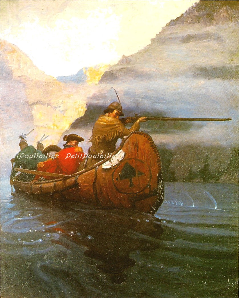
n positions of significance interacting with each other and their surroundings. When I watched the chase scene in the modern movie interpretation, I couldn’t help but compare it to those paintings.


The first time I met my father-in-law, he took me to the Brandywine River Museum. My mother-in-law studied at the Barnes Foundation and he knew this would be a great outing for us to get to know each other. It stood for the full time of our lives together as one of my favorite experiences. He was not an artist, but he knew great art. When I saw Wyeth’s work along with Pyle’s, I was amazed at the scale and depth. His characters almost walk off the wall in all of their terrifying and wonderful glory.


Maybe I will do more of this blog. It was fun to browse the images and consider his work again.

Wednesday, December 2, 2009

M: Piet Mondrian

Since my college days, I have been intrigued by the artwork of Piet Mondrian. Although his signature style took many years to develop, we were able to view in compressed time the development of his idea. But I continue to struggle with understanding the thought process that moved him in that direction.

The impressionistic and realistic work that marked his early career morphed into the most simplistic abstraction of line and color. When I explored his paintings, I was interested to see the various self portraits he completed over time. His 1900 self-portrait is very impressionistic, flat, and direct. It is a far cry from his 1942 pencil representation.

“In 1911, Mondrian attended the exhibition of Georges Braque. The work of the French Cubist impressed the Dutch painter greatly, as it paralleled much of what he had been experimenting with on his own, and Mondrian resolved to visit Paris, fascinated by the artistic innovations being introduced there.” (http://www.abcgallery.com/M/mondrian/mondrianbio.html) Where Mondrian deviated from Cubists like Picasso and Braque was in his application of the style to landscapes rather than people or still life images.

When you look at his tree paintings of 1912, you can almost watch the transition in real time. The Grey Tree is still recognizable as a tree, although stylized. Trees in Blossom has been simplified, but still symmetrical and tree-like. Composition Trees II has almost lost all of its nature as a rendering of a recognizable tree.

The painting Composition with Yellow Lines seems to be the penultimate simplification.


“Through all this, Mondrian advanced with his theory. As during all his periods of experimentation -- and probably as a consequence of frequent travel -- his output dropped, but each piece was executed with a lot of thought and deliberation. New York, New York (1941-42) features a larger number of colored lines, as the artist sought to break up the established structure of his work. By New York City I (1942), black lines are completely gone. In Broadway Boogie-Woogie (1942-43), the colored lines are broken up with patches, completely defying the definition of anything that could be called drawing.” (Olga website)

Thursday, November 19, 2009

L: le dejeuner sur l’herbe (Lunch in the Grass) by Manet

It has been a little while since I posted the last time. Besides being very busy with life, I have focused a good deal of attention on my other blog http://www.365two50.blogspot.com/ and creating illustrations and paintings.

Yesterday, I was working on reupholstering a chair and I had the television on for company. I wandered on to Ovation TV and a program about this painting “Every Picture Tells a Story: Le Dejeuner Sur L'Herbe.” Art critic Waldemar Januszczak told the story behind this very important painting—a great deal of which I didn’t know.

He described this painting as being one of a few works of art that singly changed the direction of art. Excuse me if I don’t remember the wording exactly and I can’t find the video clip so we will have to rely on my paint-fume affected memory. Anyway, Januszczak indicated that this work caused the stir that directly motivated the Impressionist movement and subsequently modern art, so that is how he supported his contention. Ok.

The painting is one that I have always been curious about since I took a good deal of “art in the dark” in college. But the story he tells is so much more interesting.

The typical art class description follows the lines that I found on Wikipeadia


“In 1863, Manet shocked the French public by exhibiting his Déjeuner sur l'Herbe ("Luncheon on the Grass"). It is not a realist painting in the social or political sense of Daumier, but it is a statement in favor of the artist's individual freedom. The shock value of a nude woman casually lunching with two fully dressed men, which was an affront to the propriety of the time, was accentuated by the familiarity of the figures. Manet's wife, Suzanne Leenhoff, and his favorite model, Victorine Meurent, both posed for the nude woman, which has Meurent's face, but Leenhoff's plumper body. Her body is starkly lit and she stares directly at the viewer. The two men are Manet's brother Eugene Manet and his future brother in law, Ferdinand Leenhoff. They are dressed like dandies. The men seem to be engaged in conversation, ignoring the woman. In front of them, the woman's clothes, a basket of fruit, and a round loaf of bread are displayed, as in a still life. In the background a lightly clad woman bathes in a stream. Too large in comparison with the figures in the foreground, she seems to float above them. The roughly painted background lacks depth — giving the viewer the impression that the scene is not taking place outdoors, but in a studio. This impression is reinforced by the use of broad "photographic" light, which casts almost no shadows: in fact, the lighting of the scene is inconsistent and unnatural. The man on the right wears a flat hat with a tassel, of a kind normally worn indoors.
Despite the mundane subject, Manet deliberately chose a large canvas size, normally reserved for grander subjects. The style of the painting breaks with the academic traditions of the time. He did not try to hide the brush strokes: indeed, the painting looks unfinished in some parts of the scene. The nude is a far cry from the smooth, flawless figures of Cabanel or Ingres.” (http://en.wikipedia.org/wiki/The_Luncheon_on_the_Grass)


The same site included a quote from Emile Zola, a great French author of the time:
“The Luncheon on the Grass is the greatest work of Édouard Manet, one in which he realizes the dream of all painters: to place figures of natural grandeur in a landscape. There are some leaves, some tree trunks, and, in the background, a river in which a chemise-wearing woman bathes; in the foreground, two young men are seated across from a second woman who has just exited the water and who dries her naked skin in the open air. This nude woman has scandalized the public, who see only her in the canvas. My God! What indecency: a woman without the slightest covering between two clothed men! That has never been seen. And this belief is a gross error, for in the Louvre there are more than fifty paintings in which are found mixes of persons clothed and nude. But no one goes to the Louvre to be scandalized. The crowd has kept itself moreover from judging The Luncheon on the Grass like a veritable work of art should be judged; they see in it only some people who are having a picnic, finishing bathing, and they believed that the artist had placed an obscene intent in the disposition of the subject, while the artist had simply sought to obtain vibrant oppositions and a straightforward audience.”


Supportive, but far from what Januszczak describes. I found it interesting to learn the story he relates. There are several references to Masters works in the composition including: Marcantonio Raimondi's engraving The Judgement of Paris (c. 1515) after a drawing by Raphael; The Pastoral Concert, 1508, by Giorgione ;or possibly Titian (in the Louvre); and Giorgione's The Tempest. Januszczak said that these were not so much inspirations as jibes at the old masters, in keeping with the general tone of the work.


He picked apart details from the painting, beginning with the most obvious—the nude. As a background note, Manet’s father was a judge who heard cases of vice. He indicated that the face model, Victorine Meurent, was an artist and a common woman who might have appeared in his father’s court. As with much of the painting, this would be a snipe at his father. I was against the law for men and women to bathe together and people never bathed nude at the time. Again, a shot at the nature of the laws themselves. The description of the men as “dandies” is incorrect. The hat worn by Manet’s brother is the type worn by art students of the time. Januszczak describes this as a joke, accomplished artists presented as students. The woman in the background is seen as gently bathing in the water. He said that French women of the time would go into the water mainly to pee and that fact is not lost in this painting.


Many of the elements of the painting were attacks on society of the time. He also pointed out a frog, which was a nickname for a prostitute, and a bird, which was meant as an attack on organized religion.


I know that I am not doing his description justice, but I enjoyed the story and learning more about the meaning of this confusing composition.

Monday, September 28, 2009

K: Gustav Klimt

“I have the gift of neither the spoken nor the written word, especially if I have to say something about myself or my work. Whoever wants to know something about me -as an artist, the only notable thing- ought to look carefully at my pictures and try and see in them what I am and what I want to do." Gustav Klimt (http://www.expo-klimt.com/)

I was visiting the home of a friend of my brother. He wanted me to do a portrait of his wife and children for a Christmas present and was showing me some photographs to use as reference. I noticed that he and his wife had some old artwork and he showed me around. In his dining room, he had a Klimt painting. He almost dismissed it as we moved by, but I was stopped in my tracks.

That’s the effect this artist’s work has. It is so unique and powerful and distinctively his.

Gustav Klimt was born in 1862 in Baumgarten, near Vienna, Austria. His father was a gold engraver but unsuccessful in business so the family lived in poverty (expo-klimt.com). According to Iklimpt.com (which has a great multimedia experience) “from 1900 to 1918 Gustav Klimt dominated the art scene in the capital of the empire of Austro-Hungary.”

He attended the School of Arts and Crafts where his style was hyperrealistic and he learned many diverse skills and techniques. In 1899, he was commissioned to paint a mural for a rich industrialist. He painted “Shubert at the Piano.” Following that he was commissioned to decorate the Great Hall of the University where he presented “Philosophy” in 1900. Congress commissioned a poll where Klimt was accused of creating pornography in the images.

In response to this criticism, he painted “Goldfish” a painting where the main figure, a naked woman, dominates the canvas with her backside to the viewer. Apparently he intended to title this painting “to My Critics.”

At that time in Austria, all artists who wished to make a living belonged to the Cooperative Society of Artists, a very conservative organization. Klimt felt this society was keeping young artists from progressing and pulled away, forming The Secession. A poster of Pallas Athene, the Secession’s protectress, rendered in his now trademark style announced the first exhibition.

According to the website, “Klimt’s work exemplifies the encounter between the old art…and the new art of the XXth century. One of his greatest accomplishments was…the introduction of sexuality in art.”

Klimt was able to change and adjust his style to the times. He was even a successful landscape painter in an effort to fit into the Impressionist style.

I am inspired by his ability to go from a very literal artist to a very expressive one.

Tuesday, September 15, 2009

J: Jasper Johns


If you have never seen a sculpture or painting by Jasper Johns in person, you may have a tough time understanding the importance of his work. To view his art in the context of the Photoshop age and to judge it based on a 3” x 5” plate in an art book (or worse yet, a jpg on a webpage) would leave you wanting.

Take a trip to MoMA. That’s something that any artist or lover of art needs to do for its own reward.

When you have the ability to see a room full of Jasper Johns work—and then compare it to the original works of Marcel Duchamp, Robert Rauschenberg, and Andy Warhol—perhaps you can make some observations and judgments about the impact of his work.

I recently caught a video of the American Masters Series on Jasper Johns where he discussed his process and some of his most famous works. In particular he talked about creating the Balentine Beer Can sculpture and his Brushes in the Coffee Can bronze.

“There may or may not be an idea, and the meaning may just be that the painting exists.” This quote by Johns is amazingly thought provoking. I am challenged by the inspiration for painting and the subject. When I attempt to paint abstractly, I struggle with putting my “ego” aside and allowing the image to come forth from within.

Perhaps further review of Johns work might inspire a direction. In particular, the work False Start comes to mind. I understand that at one time this was sold for $80 million dollars, making it the most expensive work sold by a living artist (at the time of sale). The balance of light and color and the use of text in the painting intrigues me. The strokes are bold, yet controlled.

Another work, Figure 8, also speaks to me. When I played lacrosse in college, my number was 8. I was a goalie at the time and I remember my coach thinking it was funny to put two big round targets in the middle of my shirt. My college coach was, next to my Dad, one of the most influential people in my life. So I keep that memory and joke near and dear to me. The curves of the number are so well crafted and formed by so many different lines and colors. It maintains the purity of the typography, while being as loose and abstract as possible. Your mind completes the work making it a very interactive painting.

An aside: I almost used the word “piece” here. I try to never use that word when describing a work of art. I think it is a trivialization of the effort and expense in personal terms required to make artistic expressions. I guess that goes back to hearing it used so often by marketing or sales people to universally puff up anything they are trying to sell. “This is a fabulous piece” or “This is a significant piece in the collection.” I don’t create or study just a portion (piece) of art. Usually I like to consider—or have considered—the whole work.

Suffice it to say that a virtual trip through the jpgs of Jasper Johns can provide great inspiration, but nothing compared to a walk through of the actual thing.

Tuesday, September 1, 2009

I: Robert Indiana (born Robert Clark)

According to Wikipedia (http://en.wikipedia.org/wiki/Robert_Indiana):
“Robert Indiana was born in New Castle, Indiana and later relocated to Indianapolis where he graduated from Arsenal Technical High School. He moved to New York City in 1954 and joined the pop art movement, using distinctive imagery drawing on commercial art approaches blended with existentialism, which gradually moved toward what Indiana calls "sculptural poems".


The image that most people would know him for is his LOVE image—the iconic graphic and sculpture with the two first letters stacked on the second two and the “O” slanted at an angle.

The work, The Four Winds (right) caught my eye. It uses an approach that is very common for information graphics by attaching symbols to words (in this case numbers). The winds blow in a mix, but don't loose thier identity. I like how he mirrors the two numbers to give dimension to this very flat image.


As I searched the web for images, I found a very distinctive style that made me think of the later cutout paper works of Matisse. The image at the left was a costume design for Lillian Russell that would make an incredible poster. The colors are so vivid, yet simple.
Indiana’s work addresses social and political issues of his time in a very graphical way. A twist on his LOVE theme was used to develop a tee-shirt for the Obama campaign where he configured the word HOPE in a similar fashion.

Wednesday, August 12, 2009

H: Winslow Homer

I have been focusing on my other blog (http://www.365two50.blogspot.com/) in the little time that I have for writing these days. So I have been away from this forum, but I have been thinking about it a great deal lately. I was stuck on this letter for some reason. But I became like Billy Pilgrim in “Slaughterhouse Five”—unstuck today.

Winslow Homer decided to pop up in my consciousness this morning. Perhaps because I was surfing H’s, perhaps because I have been considering marine subjects in my painting, or just because I have always liked his work.

When I was an undergrad, I blended my business studies with an art minor. The instructor, Dorothea Barrett O’Toole (I have no idea why I can remember her name), had us select a Master to copy. I had no idea who Homer was, but came across his work and it spoke to me. As my life has progressed, I have seen parallels that make me thankful that she gave that assignment.

I copied his painting “The Lookout—All’s Well” as both a black and white value sketch and a finished painting. At the time I had switched rooms and roommates. My first roommates in college were well-versed in the Grateful Dead and Cannibus and I was not. Not that I have become well-versed. I was a product of a strict Catholic upbringing (which meant that I was well-versed in Oat Soda) and I had spent most of my high school time attempting to get into the Naval and Air Force Academies. These two things combined for what would be a valuable perspective in my military service, but lost its value after my honorable discharge.

But I digress…one of my new roommates went by the name Kong (real nickname, but I’ll leave out his real name). I never really got to know him beyond the surface level, but I imagine he was very insightful. These were little, Spartanesque dorm rooms in the barracks style where three grown men occupied the space that would comfortably fit one. So my painting on an easel took up all of my allotted space. I struggled with the scale of the bell in that painting, which Kong would point out at every opportunity. Whenever I was working on it, he would wait until I stepped back to survey my effort and would offer his critique— “the bell’s too big.”

Each year, we held a show of work and some parents would offer to buy the art. I remember standing with the parents who were in the act of buying the painting, only to hear “the bell’s too big” from a grinning Kong standing in the background. They still bought it.

When I began to copy Homer, my Dad revealed that he was one of his favorite painters. He loved the painting “Breezing Up” so I spent the rest of my copying time working on that painting. My effort was drafted well, but painted so-so. You should never try to copy Winslow Homer with acrylic paint.

According to the website http://www.winslow-homer.com/: “Winslow Homer (February 24, 1836 - September 29, 1910) was an American landscape painter and printmaker, best known for his marine subjects.

He is considered one of the foremost painters in 19th century America and a preeminent figure in American art.

Largely self-taught, Homer began his career working as a commercial illustrator. He subsequently took up oil painting and produced major studio works characterized by the weight and density he exploited from the medium. He also worked extensively in watercolor, creating a fluid and prolific oeuvre, primarily chronicling his working vacations.”

As a sidebar, I need to qualify my quotations. This site is intended to observe and I don’t spend a great deal of time in the background research, because it is only secondary to the effort. If the sites that I quote get it a little wrong, well, we all remember things differently don’t we. If any readers know the facts differently or more accurately, take a moment to think how relevant it is to my observation before you feel offended. I welcome correction, but don’t get lost in the weeds.

I was very attracted to the fact that Homer was mostly self-taught. His mother, the more influential parent, was by all accounts a very skilled amateur watercolorist. His father spent most of his time chasing the “get rich” idea without great success. At 19, Homer was apprenticed to a Boston lithographer and learned the skills necessary to become a successful illustrator for newspapers and magazines of the time.

“Prolific” scarcely begins to describe his work. There are the numerous engravings and sketches for the magazines, the endless watercolors that defined the Caribbean (still do), and the rich oil paintings that decorate the most prestigious galleries of the world. His images define his skill as a story-teller relating peaceful strolls in meadows, snipers in wartime, lifeguards in tormented seas, and other slice-of life tales.

His design sense helps him create drama and feeling in his compositions. He catches moments in time at critical points in the action to heighten the sense of the story. His rich impasto paintings are studies in light and movement which place you in the middle of the churning sea or the crashing surf with a sense of the power of nature.

I am glad that Winslow has reappeared today in my mind. I will pull out some of his images to try to guide my hand as I work on my latest struggle.